AWS Fintech
PRISM: Leadership Variance Dashboard
COMPANY
Amazon AWS
ROLE
Lead UX Designer
YEAR
2024
Timeframe
2 months
Project description
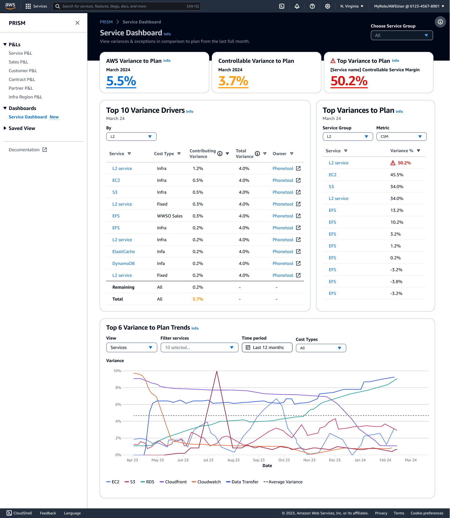
As the lead UX designer for PRISM 2024 enhancements, I collaborated with cross-functional teams to create a dynamic, insight-driven dashboard tailored for AWS finance leadership. The dashboard provides hierarchical views of key financial metrics, enabling leaders to quickly identify variances to plan and drill down into contributing factors. This project focused on streamlining workflows, improving data visibility, and personalizing insights for leaders across all AWS services.


Process & Solution
User-Centered Research
Conducted interviews with key stakeholders, including Service GMs, Finance teams, and finance leadership, to understand workflows, priorities, and pain points. Prioritized finance leadership personas while acknowledging long-term goals for broader adoption. Identified variance drivers and the ideal insight granularity at the AWS level, service grouping level, and individual service level.
Widget Design & Development
Designed widgets showcasing key metrics (e.g., Net Revenue, IM%, Contribution Margin) with interactive line charts for trend analysis. Enabled toggling between dimensions (e.g., MoM, QoQ, YoY views), categories (e.g., Customer, Service, Sales), and margin types (infra, operating, net). Introduced exception-based insights (e.g., Top 10 variances) to highlight actionable data at a glance.
Framework & Data Integration
Collaborated with development teams to evaluate visualization frameworks, ensuring compatibility with PRISM data sources while maintaining scalability. Balanced immediate UX goals with longer-term ambitions for personalization and configurability.
Strategic Alignment for Dashboarding Initiatives
Proposed a cohesive strategy to address overlapping dashboard efforts between PRISM and our dashboards homepage Uno. Emphasizing shared widget development and consistent UX through design system adoption. Streamlined processes for widget updates to ensure efficient resource use and a unified user experience.



Results & Learnings
Enhanced Financial Insights
Provided leadership and finance teams with intuitive tools to identify key drivers of variance to plan, improving decision-making efficiency.
Streamlined Workflows
Replaced manual processes with interactive dashboards, allowing users to drill into specific metrics and services for targeted analysis.
Flexible Scalability
Introduced a robust foundation for future enhancements, including saved views, advanced filtering, and broader persona adoption.
User-Centric Design
Validated the importance of tailoring dashboards to personas, ensuring that insights align with user priorities and workflows.